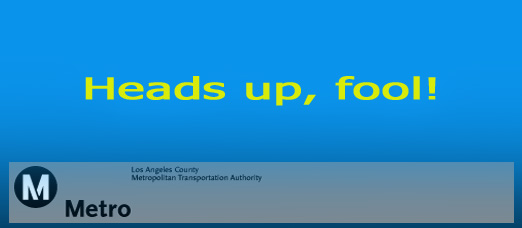
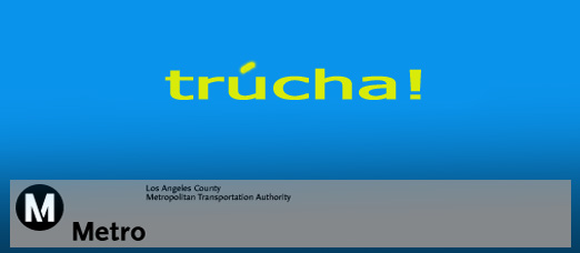
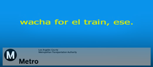
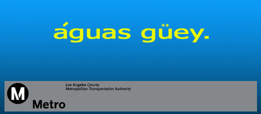
I noticed that MTA has placed Gold Line train warning and safety signs around the Eastside train route. Many of these signs are in Spanish and seem to address the local lingo seemingly in an attempt to reach as many locals as possible with their message. Here are a few sample signs I’ve seen…
LA EASTSIDE
Life Beyond The River


Al, all I can say is, I think you just titled your auto-bio, if you ever write one. “Wacha por el train, ese! The Al (Desmadre) Story.” I nearly died laughing when my girlfriend told me about your signs, even funnier to see myself. Don’t stop, man!
Metro is working to undo your snarkiness, Al:
http://www.thebusbench.com/2009/12/hey-fool-metro-responds-to-to-online-signage-with-print-brochure.html
Okay, we all know you want to poke fun at Metro but if you want to do it right, be a bit more creative …
1) Photoshop in the wording to one of their actual signs;
2) Use Metro’s correct logo. They haven’t used that one for years LOL!
Late!
H.D.
The logo in the above visual parodies IS the correct logo. It is the ScalaSans typeface. I have satirized it thousands of times over the last few years, in print and on-line.
As for the creative part of the signs, Al did just fine.