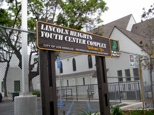
Lincoln Heights is proud home to a new youth center creatively placed in an inspired adaptive re-use of an historic church. I have yet to go inside but I hear it’s on the smallish side. No matter, the neighborhood needs more places where consumer consumption is not involved and youth are allowed.
I have one small bone to pick though, and I will digress a moment to let you know I have at times, been labeled an “aesthetic tyrant” for my critical proclamations of design, but what’s up City of Los Angeles with these tired old park signs? They might’ve looked good in the 80s or 70s or whenever they were first put together but nowadays they look just plain fuddy-duddy. The outdated thick italic font, the faux wood with pale mustard trim, it’s so…uninviting. It’s time for a make-over. I know, I know, the city is in one of the worst financial crisis in it’s history but still, graphic designers can’t be that expensive. I know a few that need work…


No kidding! I heard it was real tight quarters over there. At one point I know that they wanted to bring the skating rink to LP’s gym because it fit too snug at the center. Not gonna happen though.
The ca,ca brown sign may not be so inviting to some people but I happen to(temporarily)own a ca,ca brown sign in my garage 😉
‘outdated thick italic font’ = Tiffany Bold Italic.
More de rigueur now than you’d imagine… 🙂
These signs never looked good; ugly and tacky are two of the words that might describe them. I don’t remember exactly what the previous signs were like, but I know that when I first saw a sign like this one at Echo Park Lake many years ago I wondered why the city couldn’t have stuck with the old signs. I believe they were far more simple and tasteful — certainly far less offensive that the overly fussy fake wood ones.
Ana, I won’t ask how you got your hands on one of those signs, haha!
Leopold, thanks for the font name. I tried to figure it our before posting but could not. So it’s creeping back into style, eh? Maybe in a different context it could have some appeal…
Nancy, yes! Someone gets me! 🙂 Thanks for your comment.
A place can’t speak! Grammatically and simply, you announce “Welcome to…the park/center/etc”.
I can’t reveal my sources but I also happen to own one of the rings from the O.G homey bars…..Yepa Yepa!
P.S Love my spam word “Chingas” 🙂
My old Church, True Light Presbyterian, now branched out to Monterrey Park…..The Church was too small to hold all the members.
It was a White Presbyterian Church that transferred ownership to the Chinese in the 60’s.